I was hesitant, questioning myself over and over on this color choice, but ultimately went with my gut instinct - my first choice that I had picked out before we even bought the house - and boy, did it pay off. I can honestly say that this is my favorite room we've painted so far. I couldn't be happier.
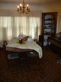
If you want a reminder as to what the dining room originally looked like, look no further than this picture...

Yes, ugly brown shag carpet covered the floors. The room was so dark because of the curtains you could hardly see the room itself. The dark stained trim made the room feel even darker, and made the cream color on the walls feel dingy and boring. And it was cramped and cluttered.
We started the transformation of this room by ripping up the carpet and refinishing the hardwood floors. I removed the curtains to let in some light. Then we painted all the trim white, and the ceiling a color called Breath of Blue.
Here's a glimpse of the white trim and blue ceiling from this recent post...

And finally this past week, we finished painting the walls of the dining room. The color choice was called Colonial Beige by Valspar's (Lowe's) Waverly Home Classics collection. It is a brown color with a gray undertone - although looks mostly brown in the pictures.

The white trim pops so nicely against this color. And the windows just look beautiful (although they still need curtains). The bookcase below is actually going to be moved into our home-office-to-be and a white hutch is going to be brought in go on that blank wall.

The blue ceiling compliments the brown so beautifully. I love the combination. As you can see, the only "original" piece still in the dining room is the chandelier. But it won't remain that way for very long...

Here is an up close shot of the wall-crown molding-ceiling combination. Too perfect for words.

The corner curio cabinet stands out now that it is white. And we painted the interior the same color as the walls so that all my china and white server-ware will stand out in it.

While this is a dark color, there is so much light in the room from all the windows it doesn't feel oppressive. And it coordinates so well with the green we used in our living room (since the 2 rooms are side-by-side). The combination of earth tones fit the bungalow-style house well.

The table you see in the room is actually going to be moved to our enclosed porch eventually and a new, expandable table placed in the room instead.
This is a side-by-side comparison of old and new.


So, what do you think? Does it capture the beautiful-elegant-rustic-charming-versatile look I was going for? Does it have "wow" factor? I sure think so!
I can't wait to begin decorating this room. It's the perfect color for fall decor, but will look great in other seasons as well.
Psst... if you click on the individual pictures of the post, your PC should blow them up on your screen.


I know this is an old post, but I wanted to share that I used the same color in our living room. I still love it. It's such a versatile color that seems to go with everything.
ReplyDeleteDo you still love it in your dining room?
I just discovered you blog today and I have enjoyed scrolling through and seeing all your projects! I am in love with this color. Going to have to see if Lowe's still carries it.
ReplyDeleteI used the colonial beige in our master bedroom for the home we sold over a year ago and I loved it so much, I'm going to use it in our master bedroom at our new house as well. I have a beautiful bedding set that matches perfectly and painted a picture copying the print on the accent pillows using some of the paint color too. My Lowe's no longer carry the Valspar "Waverly" collection, but they have the formula to mix it.
ReplyDelete