November 30, 2010

Frame It!

Not sure what to put in all your picture frames this time of year? Want to switch out pictures for different seasons? Well, here is an idea that I fell in love with and will probably try in my own home.

While roaming around PotteryBarn, I noticed the store had displayed on shelves different picture frames that you can purchase for around the house. However, it wasn't the frames that captured my attention but the pictures within the frames. What the store had done was taken some beautiful winter scene pictures and displayed them in the frames. The neutral colors of the winter settings could accommodate any room color. The frame set the tone for how fancy or rustic the scene felt.

The idea was very simple and would be easy to execute if you already have frames around the house to use.

This first shelf displayed 2 pictures that were set in polished silver frames for a fancier look. One frame had a black and white picture of some some winter trees. The other frame had a picture of frosted window panes. Both look so elegant.


The second shelf had 2 pictures displayed in wood frames for a more rustic feel. One had a picture of red berries for a splash of color. The other frame had a scene of rows of trees set in the snow.


This next frame is a box that has pictures on all sides of it. I liked this picture of twigs and red berries covered in snow.


Lastly, here is a sofa table that displayed multiple silver frames with various winter scenes all set in snow. The frames were surrounded by silver pine tree figurines and silver candlesticks. Notice how the frames, trees, and candles all very in height and size - keeps things interesting. A beautiful table setting.


All of the pictures were interesting to look at and showed off how beautiful nature is in the winter. And if you aren't able to take and print pictures yourself, I'm sure there are all kinds of beautiful winter-scene cards/postcards out this time of year that could be displayed in the frames instead.

I've still got to dig some of my frames out of the moving boxes, but this a project I'd like to do soon. The nice thing about winter pictures (as opposed to "Christmas" pictures) is that you can keep them up through January and into February. Then switch out the pictures for spring ones when March/April rolls around.

I'd like to get a collection of winter/spring/summer/fall pictures to swap out in different frames throughout the year. It keeps the house from getting stale with the same ol' pictures all the time.

So, what do you think? Will this idea be easy to replicate? Time will tell... Pin It

November 29, 2010

Give a Gift

While window shopping last weekend, I came across 2 items in Crate and Barrel that I thought would make great host/hostess gifts for any holiday parties you may be attending this Christmas season. And the bonus part is that with a little effort and time, you could put these gifts together yourself and save some moolah in the process!

The first gift was a Holiday Nut and Berry Mix - one of Crate and Barrel's glass canisters filled with the nut/berry mix and tied with a red ribbon around the top. The store had this item listed for $19.95.

However, if you purchased the glass canister by itself (or any glass jar from another store), you would only spend around $6 for the small canister and $8 for the large canister...


The nuts and berries could be bought at a grocery store for a few dollars. And you could use any Christmas ribbon you already have packed away with your Christmas items to tie around the top of the container.

All this could be put together for well under $20.


The second item Crate and Barrel showcased for a holiday gift was a Christmas Cookie Mix - a glass jar filled with the dry ingredients needed to make Christmas cookies. The dry ingredients were layered for a pretty visual effect. Again, a ribbon was tied around the top to dress it up. Lastly, a little card was attached to the ribbon with the cookie recipe.


The item sold for $11.95 at the store, but assuming you already have most of the ingredients in your pantry along with a ribbon, the only item you would need to purchase is the jar/canister. So, this gift could be done for around $5. Not too shabby when gift-giving can quickly add up around this time year.

And if you have a little extra time, you could make a batch of the cookies to give along with the jar of ingredients. Yum!

So, what kinds of inexpensive gift-giving ideas do you have to share? Anything that you've given in the past that people love? Do tell! Pin It

November 24, 2010

Window Shopping

This past weekend my mom and I went window shopping to look at all the purdy things that were set out for Thanksgiving and Christmas. There were so many decorative items that I loved and wished for, and I decided to take a few snapshots of some of my favorite items.

The sidewalks outside the stores were lined with all kinds of greenery to make the place look festive. I especially loved this beautiful fern with the little red berries.

Crate and Barrel had these beautiful candle holders. I liked the combination of wood and glass - keeps the balance between rustic and elegant.

Williams-Sonoma displayed Thanksgiving-themed dinnerware. Very lovely. But very expensive.

Most of our time was spent in PotteryBarn oooh-ing and aaaah-ing at both the Thanksgiving and Christmas decor.

I love this turkey gravy boat. The neutral colors would work with any color scheme you use for Thanksgiving table setting. I bet kids would love to dip gravy out of this boat. Pass the turkey, please!

These glass vases and canisters were displayed on many shelves in the store. Full of silver pine cones and red berries...

...and fake snow and branches. Notice the silver ornament also sitting on each shelf. It adds a sparkling touch.

I thought this platter was beautiful. I liked the blue and green and brown color combination. And you know my love of bird-related items...

Lastly, here is a table-scape I shot through the window (pardon the glare) in front of PotteryBarn. Everything on the table - pitchers, platters, plates, pottery, candles, napkins - were pleasing to the eye! And I love the brown wicker stars hanging above.

This day put me right into the Holiday mood. I can't wait to start Christmas decorating at the house. I did buy a few little things. But that's for another time. Pin It

November 19, 2010

Pop Quiz: Discover the Style That Makes You Smile!

One of my favorite places to shop and find great deals is Home Goods stores (often in/part of Marshalls). You can often find some inexpensive accessories that brighten your home and add a great eclectic touch so that everything isn't so matchy-matchy.

Well, I found out today that they have a great online quiz aimed at breaking down your design style. And being the quiz-guru that I am, I had to try it! Here are some of the questions I answered and then my results...


Question 2: If the sofa is the centerpiece of your home, choose which best represents your style?


I selected the sectional sofa since this is what we want to buy for our family room anyway. It provides the most seating for the space at hand.

Question 7: Choose the room that would make you happiest!

I selected a fairly casual room with neutral colors. Looks inviting and comfy, but not sloppy.

Question 8: Now it’s time to dress it up! Choose the group of furnishings you favor.

Again, I chose fairly casual, earth-toned furnishings. The little chair especially drew me in.


My Smile-y Style-y Results: EARTHY CASUAL! (go figure)
According to the site... You're interested in creating a welcoming home where people feel comfortable and happiness flourishes. You appreciate the warmth and individuality of natural materials and handcrafted things and are inspired by colors and forms from nature. You love mixing up different textures and are sensitive to the tactile qualities of objects. Your style is grounded and solid, not flighty or frilly. And you are never taken in by the trend of the moment.

You value serenity. While there are probably a lot of interesting things in your home, they are joined by your taste or a certain palette that keeps them in harmony. You appreciate the beauty in simple forms. Whether fancy or plain, you appreciate things that are well made and function as well as they look. You also have a strong respect for the environment and craftsmanship. You care about how things are made, and how they are used.

I don't know about you guys, but this description hit me spot on!!!

The only think I was surprised by was the color pallet the site gave me. It selected colors in the blue-range. And while I do decorate with blues in several rooms of my house, I don't picture it as being "earthy" the way I do greens and browns.


The site also gave me a few tips to enhance my earthy style...

1. Your Design Challenge: UNIFY
The good news is, you probably have many things you love and have collected, and no one would ever say your home is boring! You've done the hard part; now you just need to pull it all together. If your furniture seems like a mish-mash, unify it through similar upholsters or slipcovers. When grouping objects, try to find something they have in common. If they share a shape, color or material, they will look like a collection. A tray is every decorator's secret weapon for making groups of small objects look purposeful and sculptural. If your accessories are all over the map, try subduing the upholstery or wall color, so your small items are the stars.

2. Your Happy Place
Make this room as comfortable and inviting as possible by bringing in some real furniture like an armchair or a sofa if you have the space. A little lamp on the counter or decorative hanging light can set the mood. Stools are great perches and can easily be moved around. Don't forget to bring your personality and style into this room: hang some art or display a collection of family photos in mixed frames. Consider bold, happy colors in the kitchen as well, like brightly colored pots and pans, big bowls for corralling fruits and vegetables, and trays for spices, oils, teas and pepper mills.

3. Be Party-Ready All the Time!
Scent:
The first thing you notice about a home is how it smells. Use naturally fragrant cleaning products. If you find a scented candle or fresh potpourri you love, stock up on it. Any scent you like, whether perfume or linen spray, can be used on upholstery, bedding or just spritzed into the air.

Mood: Nice, flattering light makes us feel good. So nix the harsh, direct light from overhead fixtures in favor of the softer glow from floor and table lamps. Also, stock up on some votive candles and a couple of hurricane lanterns for setting around the room.

Food: Devote space in your pantry or on a shelf for go-to party essentials: crackers, dip, chips, nuts—whatever you like to serve. Keep on hand a collection of attractive bowls and cocktail napkins, and you'll be able to set a spread—instantly!

Drink: The simplest and chicest thing is to have a drinks tray or table always set up. Include a mix of pretty glasses, an ice bucket, a lovely pitcher, and bottles of soda and water. When the bell rings, just add ice and limes.


So, what do you think? Did the quiz nail me? I was very pleased with the results!


Want to find out the style that makes you smile? Click Here! And don't forget to share the results!

Pin It

November 18, 2010

Small Space, Big Impact

Many of us have small spaces in our homes that we aren't quite sure what to do with. We often think, "If this space was just a little bigger, I could do..." But what we may not realize is that sometimes our smallest spaces provide us the opportunity to make the most use of the space in the room. And that can have really big impact on the overall look in the room.

For example, I love this small reading space! From Kevin and Layla's home and blog, The Lettered Cottage, the beige and cream horizontal striped walls aren't too overpowering since the room is small. The cozy daybed invites you to come in and relax.


Don't have much space for a bed and nightstands in your guestroom? Think about utilizing the space behind the bed for shelving to store an alarm clock or decorative items. And sconces can be used for bedside lighting.


Don't have space for a dedicated office? Turn your guestroom closet into one! Removing the closet doors keeps the space more open. By adding curtains, you can still close it off if needed.


I love this little living room. Kinda girly and rustic, but very charming and inviting. The white walls keep the room airy, and the pops of color add warmth and interest.


Make the most use of under-the-stair space by creating a functional storage space or coat closet.


Bunk beds or lofts are a great way to save space in a child's room while adding great architecture and design at the same time.


Does this encourage you to make more use of your small spaces?

I can't wait to redo our smallest bedroom located on the first floor of our house. It's at the bottom of list in terms of priority, but I hope to have a ton of fun with it when the time comes! Pin It

November 15, 2010

Smile! It's Monday!

Knowing that Monday is such a Blah-day, I thought I'd leave you with a few happy images to brighten your day. Whenever I'm bored or sulky, I just look at beautiful rooms and they make me smile!

1. Great green-ish/yellow-ish kitchen. Unexpected color scheme. Love the rustic wood floor, glass cabinets for that "open shelf" feel, and sleek black counters. Notice how the colors carry into the dining room behind it? Great coordination!

2. Beautiful Hallway! Who wouldn't want built-in storage like that?! I also love the hutch waaaay at the end of the hallway with its contrasting natural wood finish.

3. Child's bedroom (or fun guest-type room). What child wouldn't want to sleep in these beds? Too cute for words! And I'm digging the funky orange color scheme.

4. Finished Laundry Room. Emphasis on the "Finished" part (as mine is currently part of a very un-finished cobweb-y basement). What fun to have painted beadboard cabinets and a coordinating back splash! But that's another project for another day in our house...

5. Living Room. Beautiful. Casually elegant. Charming.


Happy Monday!


All images courtesy of
DecorPad.

Pin It

November 13, 2010

Doors Galore

Some time in the near distant future (is that an oxymoron?) I would like to repaint the outside doors on our house. Currently, all the outside trim, eaves/overhangs/soffits, and doors, and even the garage are painted in a creamy-yellow color. And while I really do love the color yellow (it a favorite for those who know me well), I just don't like the feeling it gives against the brown brick of the house. Plus, it was painted a while ago and is in need of touch up anyway.


This will be a very large project to repaint all of this, but I will probably start with the front and side entry doors. And even though this project is a ways away, I'm already trying to decide on the color I will use. I admit, front doors are a slight obsession of mine. They are the first thing you see when you enter the house and can add so much character and charm if you really do 'em right!

There are a million different colors to choose from when painting exterior doors, but below I've listed a few of the traditional options that I'm considering (or not).

1. The White Door

Pros:
  • As we replace all the windows in the house, the new window trim will be white. So, the doors would match the windows.
  • Looks clean and crisp
  • Can be dressed up with different decor in different seasons for great variety.
  • Very traditional.
Cons:
  • Shows dirt easily.
  • Kind of lackluster.

2. The Natural Brown Door

Pros:
  • The natural wood matches the architecture of our bungalow-style house really well.
  • Hides dirt.
Cons:
  • Would blend in with the brown brick too much. So, this is an unlikely choice.

3. The Black Door

Pros:
  • Another very traditional choice.
  • I really like black with colored siding - it looks polished and elegant.
Cons:
  • Not so sure we have the right color brick or style house for a black door.

4. The Red Door

Pros:
  • Adds great pop to the entry way.
  • Very common door color for the capes/bungalows/dutch-colonials in our area.
  • Great accent color to the neutral brick.
  • Ask Joey: I've always wanted a "white house with black shutters and a red door." Well, I didn't get a white a house and we don't have black shutters. But I could still choose a red door, right?
Cons:
  • Red door can fade easily with a lot of sun-access. This would mean re-painting often.
  • If you get tired of the color, it's more difficult to change out.
  • I currently don't have much red inside the house, so it doesn't really flow with anything else.

5. The Green Door

Pros:
  • A nature-color, it fits the outdoors well.
  • It adds a pop of color without overdoing it.
  • The combo of brown brick with a green door uses the same colors we currently have in our living room (which has green walls with brown brick fireplace and accents).
Cons:
  • Can't think of much.

6. The Blue Door

Pros:
  • Blue is an unexpected choice, but doesn't overdo it.
  • Great accent color.
  • Also a nature-ish color given the sky and water are blue.
Cons:
  • I actually think the blue might look ok against the brick, but it really doesn't fit the overall "look" we have going on in the house.

What's my conclusion? After this breakdown, I think I've decided on the following order for color preference:
  • Green (leaning heavily toward this)
  • White
  • Red
  • Black
  • Blue
  • Brown


What do you think? Is there another color I haven't thought of? What color is your front door? Pin It

November 10, 2010

Organize This: Kitchen Cabinets

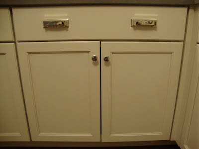
Now that we finally have all of our kitchen cabinets installed, I have been working on re-organizing our kitchen items to fill the new cabinets. I wanted to arrange things in a way that makes the most use of the space but also has items located in places that make sense for how I will use them.

One of the first set of cabinets I began organizing is the extra-tall cabinet on the right side of the kitchen that goes down to the counter and the cabinet beneath it under the window. I designated this area as kind of my dry goods baking center (with a few other items mixed in). Since this area has the largest stretch of counter space in the kitchen, I knew I would do my mixing, rolling, and putting-together-of-baked-goods here. So, I wanted most of these types of items gathered here.

The tall cabinet has 4 shelves, which I stacked with all kinds of handy items.

The bottom shelf is mostly filled with practical everyday stuff - cookbooks, my recipe box, and extra recipe cards are easy to reach for all the cooking and baking I do each day. I also stored my largest container, which is full of flour, on this shelf (it didn't fit on the other shelves because it was too tall). It acts as a sort of book-end and keeps the cookbooks from falling over. And then my little sugar container and salt and pepper set are also in here - for when I need a sprinkle of sugar on my cereal (shhh-don't tell) or need to add a dash of S&P to my plate of food. These are my grab-n-go items.

The 2nd shelf up contains the following: my set of canisters filled with all kinds of goods, another clear bin filled with sugar, a container of Swiss Miss Hot Cocoa, and some coffee filters and creamer.

And here's what the canisters contain...

The 2 largest have Brown Sugar and Powdered Sugar. Guess my brown sugar is getting a little low...

The 2 smaller canisters have coffee and tea bags. Hence I have the coffee filters, creamer, and hot cocoa mix stored on this shelf also. It's kind of a drinking and baking theme all in one. :)

Finally, the 3rd and 4th shelves contain other baking ingredients: baking powder, baking soda, salt, shortening, vanilla, chocolate chips... and baking mixes for brownies, cakes, muffins, etc...

You can see that I lined the 3rd shelf with shelf paper - just in case anything spills or leaks - I want to protect my cabinet shelves and keep things as neat as possible.

So, here is the total product. One big happy family.

Given the location of most of my baking ingredients, I figured it would make the most sense to store the items used to mix, measure, and bake the ingredients right below them in this drawer and cabinet combo.

The lower cabinet has a 1 shelf in the middle. I set my pans - cake pans, muffin tins, cooling racks, loaf pans etc - on this shelf. On the base of the cabinet, I have my mixing bowls, mixer, measuring cups, pie plates etc. Everything fit with ease and is easy to access.

In case you are wondering what that thing in the back of the cabinet is? Most of the old houses in Kenosha have an old iron milk holder where the milk man used to drop off the milk (it can be accessed from the outside of the house) and the owners could open it from the inside of the house. Cabinets didn't use to exist on this wall, but we added them. So, we cut out the back of the cabinet to fit around the milk holder since we didn't want to remove it.

The drawer of this cabinet contains a bunch of kitchen utensils - pretty much everything except silverware/serving-ware and some items I have specifically by the stove. The smaller items are in a large storage divider. The bigger and awkwardly shaped items - rolling pin, electric knife, meat mallet, masher etc - are just laid out in the drawer.

This was one of my favorite sections of the kitchen to put together. I haven't changed a thing. I can easily access everything when I need it. Each item has it's own little home. Just as it should be. Pin It

November 8, 2010

Light It Up

One more purchase for the house = one step closer to "completion".

At least, that's the way I look at it.

Thankfully, in this case, we spent very little in order to make our living room a little more functional.

Here is a panoramic-type view of the living room. As you can see, there are 2 lamps beside the chairs, but the couch is in the dark. And the walls are still pretty bare in that particular corner of the room. There really isn't room on either side of the couch to put an end table and lamp, but the couch needs some sort task-lighting.

Enter this swing-arm wall lamp we bought from Lowe's (in apparently the most wrinkled box we could find). This can be hung on the wall behind the couch for the much needed lighting on that side of the room.

We picked out a lamp with a rubbed bronze finish to coordinate with the other lamps already in the room (Lowe's does sell it in a brushed nickel finish as well).

All of the parts were included in the box... the light fixture itself plus the lampshade, harp and finial, mounting unit and screws, and metal cord cover. Everything.

Joey (loosely) followed the instructions provided and attached the mounting fixture to the wall (some drilling was involved) and then attached the lamp to that. He also had to semi-assemble the cord and plug together. The whole thing took about 20-30 minutes. The metal cord cover that goes down the wall hides the cord for a clean, polished look.

The light looks great on this wall. This close-up shot shows some of the details. I like the simple lampshade it came with, but you could always switch that out if you wanted a different look or color or texture. It's nice that the lamp can be swung from side-to-side and in-and-out depending on where the person is sitting on the couch.

Here's the same view as the 1st picture above, but with the lamp (and no Joey). Doesn't the room feel more balanced now? You can actually see the couch in the corner. And that corner looks less dull. I still have to add pictures and other items to the walls, but this is a practical start.

How much did the lamp cost? Only $40. This was great for me considering I was thinking about buying one of PotteryBarn's wall lamps for twice as much. Goes to show what a little bargain hunting can do for you! Pin It
Visit InfoServe for Blogger backgrounds.